Again, I'm overwhelmed by the response and support you've all shown me with this series. Thank you.
I want to also thank Ariel Gulluni who has donated his time and energy to translate Webisode 1 Part 1 into Spanish. This generosity will allow many more people to easily access this information. The captions are available when you view the webisode on Youtube. Thank you Ariel!
Okay, now to answer some of your questions. Originally, I envisioned writing out each question and answering them in turn. However, I realized that many of the questions and answers relate so it might be better to answer in an essay form.
For starters, I like to use a smooth, portrait linen, 2-4 times primed. In the past, I used oil primed linen but lately I've come to prefer the absorbency of acrylic-sized linen. I stretch the canvas tightly on Frederix stretchers (any brand would be perfectly fine) using stretcher pliers and a staple gun.
Before starting, I tone the linen with Raw Umber oil paint thinned with Mineral Spirits.
I use synthetic round brushes; their size varying roughly in proportion to the form I'm painting. The forms of the eye I painted in this past webisode were similar enough in size, so I did not need to change my brush size. Were I to then paint the forehead, I would switch to a brush that is more in proportion to the size of that form.
I mostly do not require any medium as I typically use the body of the paint from the tube. I do have linseed oil on standby and occasionally use it if I encounter a pool of paint that needs a little extra fluidity. I prefer to paint form opaquely as I want to have my mixtures on the palette have a predictable result on the canvas (were I to paint thinly, whatever I mix is changed by the properties of the canvas' tone showing through).
Now to color and my palette. I could simply answer this with a list, but I think that it would be unhelpful without briefly stating my views on color selection before and during the course of painting. My interest in color and its application has always been driven by the concepts I use to interpret and model form (by this I mean, mixing up tones that reflect my physical understanding of the optical phenomenon in front of me). I may attempt a one-for-one match to the colors before me or I may transpose and/or compress my color(HVC) range according to some particular artistic goal--this deliberate alteration, to have a plausible result, must be guided by an understanding of the physics of light. So, when I describe my process as consisting of me identifying the local (intrinsic) properties of an object and how my ability to see those properties diminishes as the form receives less light (thus decreasing in value and chroma) I am answering the "how" part of what I do. To successfully mix the colors you've interpreted certainly requires experience but follows this fairly simple logic originating with the local (say Red), recognizing the form type (say a sphere), the light most facing plane (therefore, the lightest in value and chroma) and the visibility of these properties as less light is received (therefore darker in value and less chromatic). This translates to mixing up a Red on your palette (an optical match to the Red in life can be attempted or, should you choose, be transposed to an alternative tone provided it subsequently follows a physical logic). From there, you search about on your palette for other pigments that will diminish the value and the chroma while keeping the hue stable. For example, if you began adding only Ivory Black to your Red, you will certainly be diminishing both chroma and the value, but you'll also be pulling the Red off of a radius to the neutral, thus shifting it towards a low chroma Violet. You then think directionally in color space and ask what might take you back towards center Red while maintaining the downward path of value and chroma. You could try Raw Umber and in a particular situation, that might be enough. If not, other colors are called upon (this should indicate the primacy of concepts over learned mixture patterns). It is the understanding of what's physically happening that keep us out of the wilderness of bizarre coloration. It also let's us follow a logic that is relational and not necessarily dependent on the optical. I find this very liberating artistically.
As far as colors on my palette I try to have highly chromatic representatives of each part of the color wheel so that I can maximize my mixing range. On an average day, I have Titanium White, Yellow Ochre (as my low chromatic yellow), Cadmium Yellow (as my high chromatic yellow), Cadmium Orange (high chroma), Cad Red (high chroma), Alizarin Crimson, a couple flesh tones (tubed or pre-mixed) as short cuts (keep in mind, these are clearly recognized as low chroma, particular values of a given hue--not blindly as a flesh tone to be used necessarily in the painting of flesh), Burnt Umber, Raw Umber and Ivory Black. Were I to paint something that had a local blue, green or violet hue, I would undoubtedly have a high chroma representative of that particular hue on my palette.
Throughout all of these answers I hope it is evident that I don't impose strict material practices on myself. It is a flexible, evolving set of habits that have developed out my best attempt to effectively paint form in space in a way that convinces the viewer while transmitting my original artistic vision.
This may leave some questions unanswered but not to worry, more webisodes will be coming soon!
Thanks for the excellent questions and the continued interest!
Scott

Tuesday, December 21, 2010
Tuesday, December 14, 2010
Webisode 2: Painting the Eye
In This Webisode, I demonstrate painting the eye in oil paint. Please post any questions you have in the comment section or email them to me directly. In another week or so, I will try to answer some of the questions here on the blog.
I will be taking a small break for the holidays, but I will be back with Webisode 3 in January.
Thanks everyone!
Scott
Saturday, December 11, 2010
A Preview and an Idea...

Webisode 2 will be here shortly. . . I hope to have it completed by this coming Monday or Tuesday. In the meantime, here is a little preview image. As you can see, I will be painting an eye and talking about ideas related to the process.
Also, I had an idea in regards to the many questions I've been receiving by email since Webisode 1. I love getting questions and try to respond to all of them, but I was thinking that it might be beneficial for everyone if I take some of the recurring ones and answer them publicly on the blog--keeping the identity of the person asking them anonymous. That way I could have a post between Webisodes that would perhaps answer questions a number of you have.
Okay, see you soon
Scott
Monday, November 29, 2010
Webisode 1 ( Part 2 ), Finishing the Block-in
Okay, part 2 is here! I can't tell you how much I appreciate the feedback on part 1. This project has just begun and all of your support makes me very eager to continue well into the future. I have every intention of keeping this a free series, so please pass it on!
Thanks!
Scott
Friday, November 19, 2010
Webisode: One (Part One), Blocking in the Portrait
My first Webisode is finally here! It's taken a while since my preview earlier this year to get setup for this series. We moved recently and I had to settle into a new studio. Now that I'm up and running, I expect to do these on a fairly regular basis. It was a lot of fun and a learning experience to produce this. Please pass this on to anyone who might be interested. Thanks!
Friday, October 22, 2010
Star Wars Art: Visions


Star Wars Art: Visions has come out and I'm very honored to have a Diptych I painted featured in the book. I have an additional two paintings featured in the Limited edition. I've posted all of them here. It was a privilege to work with Jonathan Rinzler, the executive editor at LucasBooks. I finally saw the book in person today and it's beautiful. There are many incredible paintings by so many artists. I highly recommend it: Star Wars Art: Visions
Sunday, October 17, 2010
New Small Narrative Painting

Finished this one up at 14" x 11". The preliminary drawing can be seen in the previous post.
Friday, October 1, 2010
A few new things...


Here are some things I've been working on: A very small (9"x12") figure painting, A couple of sketches for some new small whaling paintings, and the final version of "Capsized" at 14"x11" (which isn't a whole lot different than the color sketch---moved the whale tale down and to the left so that it could be a little more connected to the composition of figures, painted bigger splashes etc..). Also, I'd been meaning to add a process shot of the portrait "Becky" I did several months ago--so here it is. Thanks for taking a look!
Wednesday, September 8, 2010
Color Study for New Whaling Painting

Well, I got carried away with this study...normally I don't develop a study/sketch this much but I really wanted to see if all the elements would work. From this study I became aware of a few little things I want to adjust in the final painting--I'll talk about those things when I have the final finished so that they can be compared. This study is 10" x 8".
This Week's Figure Sketch

This one I did directly in paint, no drawing done in advance...which means I had to do quite a bit of backtracking to find the contour. It was 3 hours and I was nervous working directly so I stuck with a similar pose. Next week I'll have a female model and I might try a pose that includes the face...we'll see. Also, I've been using an alkyd drier with these, which has enabled me to work back into it quickly as I go.
Friday, September 3, 2010
Quick Figure Sketch
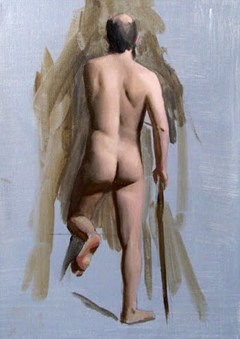
Lately I've wanted to paint during my practice sessions rather than draw. Admittedly this was sketched quickly before I started painting but I think I might just start in paint on the next one. I hope to do these often and will post as I go . . . This was done in a 3 hour session.
Drawing for new Whaling Painting
 This is the preparatory drawing for a new whaling painting I'm starting. I think that it will be relatively small (around 11" x 14"). If I can, I will post process shots.
Friday, July 30, 2010
Triumph of Gyges


 Here are some images from my new painting "Triumph of Gyges". It is 58" x 50". You can see the whole thing on my main website.
Thursday, July 1, 2010
Tuesday, June 22, 2010
Another idea from 4 years ago...


Well, my blog is now becoming a scrapbook of lost ideas. But, I received a good amount of feedback on the last post and so I thought that I'd add this other idea I had at the time I was working on the Polyphemus one. These sketches actually relate to the painting I'm currently finishing up (it will be posted soon!) in that it's from Herodotus. This is Artemisia of Halicarnassus. What I regret is not taking a photo of the model I made of the wall and rafters. Because I wanted the miniture to seem like it was 10 ft. in height I recall making the wall and ceiling dimish exagerratedly in scale so that it would hit the vanishing point it would were it larger...I even did a fresco and calculated it's necessary distortion and recopied it on the skewed model. I have no idea now if the math was all right but it actually looked really convincing through a view finder.
Monday, June 7, 2010
More old ideas...


Well, since I can't seem to finish the paintings I'm currently working on, I'll post some more old ideas that never materialized. These sketches, done from my head, are from about 4 or 5 years ago. It was right after I completed my studies at Waterstreet and before I thought of the whaling series. I don't even know now why I didn't proceed but I still kind of like it and it may make it's way to my easel yet.
Saturday, May 22, 2010
Process Shots of Older Paintings


Here are some process shots of paintings that were done between 2 to 4 years ago (the completed paintings are on my website). These photos were taken quickly with relatively poor lighting so excuse the weird raking light on the canvases. I'm currently working on another portrait and will post progress shots with it once it is finished.
Thanks to everyone who gave me suggestions (on the blog, Facebook and in person) for the Webisodes I'm working on. They will help guide the coming episodes.
Saturday, May 15, 2010
Webisode Preview
I'm working on some instructional webisodes that I hope to begin posting this summer. They will be about 5-10 minutes each and may consist of small demos, concepts or other art related material. If anyone has suggestions for the kind of thing they would like to see, please let me know.
Thanks,
Scott
Scott
Saturday, May 1, 2010
Living up to the Name of the Blog
Okay, I thought I'd get back to some actual sketch book stuff.
I'm still not quite ready to show sketches of the painting I'm planning next. I want to get a little further in some of the compositional sketches and then I'll share. In the Meantime:
 Here is another one of my old whaling themed sketches. I have a ton of these and I'll post them here and there as I go along. This one was going to be set between two rocky cliffs on a little island. Just beyond the figures was going to be a beach and the little boat the two standing figures arrived on. In the distance, off shore a bit, was going to be the large whaling vessel. The idea was that the guy on the ground deserted by stealing a little boat and had an ill fate by shipwrecking on this barren island. Anyway, the most that will come of this drawing now is the description I just gave (although writing about it makes me want to revisit it).

 These other drawings are pure sketchbook stuff. I am sort of hesitant to post them because they doesn't seem particularly relevant to any of the work I do. But, this is the kind of stuff I draw every day in my sketchbook. Doing them feels a little like writing a short story. I doodle these landscapes and little villages all the while imagining the people there, the roads they take, the lives they lead, the kind of terrain around them etc... I do this almost involuntarily. It maintains the experience drawing has always been for me since I was a little kid; one of pure pleasure and imagination. My fine art paintings are certainly fun and hopefully demonstrate that same degree of imagination but they go through an intense conceptual process that extends over several weeks and maybe months. Drawing like this is like writing without an editor and in many ways feeds into the ideas that turn into paintings.
I'm still not quite ready to show sketches of the painting I'm planning next. I want to get a little further in some of the compositional sketches and then I'll share. In the Meantime:
 Here is another one of my old whaling themed sketches. I have a ton of these and I'll post them here and there as I go along. This one was going to be set between two rocky cliffs on a little island. Just beyond the figures was going to be a beach and the little boat the two standing figures arrived on. In the distance, off shore a bit, was going to be the large whaling vessel. The idea was that the guy on the ground deserted by stealing a little boat and had an ill fate by shipwrecking on this barren island. Anyway, the most that will come of this drawing now is the description I just gave (although writing about it makes me want to revisit it).
 These other drawings are pure sketchbook stuff. I am sort of hesitant to post them because they doesn't seem particularly relevant to any of the work I do. But, this is the kind of stuff I draw every day in my sketchbook. Doing them feels a little like writing a short story. I doodle these landscapes and little villages all the while imagining the people there, the roads they take, the lives they lead, the kind of terrain around them etc... I do this almost involuntarily. It maintains the experience drawing has always been for me since I was a little kid; one of pure pleasure and imagination. My fine art paintings are certainly fun and hopefully demonstrate that same degree of imagination but they go through an intense conceptual process that extends over several weeks and maybe months. Drawing like this is like writing without an editor and in many ways feeds into the ideas that turn into paintings.
Sunday, April 25, 2010
Painting Highlights: The Size of Specular Reflections
When we look at a portrait, figure or any object we seek to paint we are faced with a variety of highlights (specular reflections*) big and small, hard edged and soft edged. The shape of the form that reflects the highlight determines the orientation of its patterns (I hope to cover this aspect in an upcoming post) while the size is determined by the size of the convexity (or concavity--although I will only be presenting diagrams of convexities) and size of the light source. In figure 1 you can see how the size of the light source determines the degrees of a convexity that reflect the highlight at the angle of incidence = angle of reflection. If you imagine a point on one end of the light source and its geometry to the viewer, then the opposite point and its geometry to the viewer and the gradation of points between with their respective angles to the viewer you end up with the highlight's size according to the size of the light source. This establishes a constant we can rely on in any given scene: a viewer from a point in space will see a set of specular reflection in a set parameter of degrees.

So, why do we have highlights of different size throughout the figure when clearly the size of the light source remains constant?
This is answered in figure 2. Here we can see three convex forms (as depicted by the three circles inside each other) that are reflecting a highlight in the same range of degrees. The size of the highlight zone grows in proportion to the scale of the convex form.
One of the most obvious examples of this in everyday life would be the type of reflections you encounter on a vinyl record (figure 3). Each little groove has a tiny side that makes up convexities of progressively smaller sizes. The highlight pattern that emerges looks much like the range of degrees illustrated in figure 2.

 UPDATE: Some of you may recognize that I've removed a portion of this post (some of the above diagrams will now seem a bit out of context, but may still have worth). This is because I need to rethink aspects of what I posted concerning the intensity of highlights. I don't want to put misleading information out there so I will revisit the topic in the near future with everything sorted out. In the way that teaching has been helpful in forming my concepts over the years it seems that blogging may be useful in the same way. I write something as I've discussed it and in rereading it I become more particular about the language I use and its implications. I hope to remain this vigilant about the information I offer and perhaps this demonstrates my desire to find the truth behind our visual experience.
I would appreciate any and all feedback.
*note* I will interchangeably use "highlight" and "specular reflection" to refer to the same phenomenon. Highlight is more convenient when talking about the net visual effect and is therefore good artist language. Specular reflection refers more to the parts of the highlight that produce the properties associated with highlights. Pure specular reflection would be found in a perfect mirror where there would be no absorption or diffusion to dilute it's effect.
 In figure 1 you can see how the size of the light source determines the degrees of a convexity that reflect the highlight at the angle of incidence = angle of reflection. If you imagine a point on one end of the light source and its geometry to the viewer, then the opposite point and its geometry to the viewer and the gradation of points between with their respective angles to the viewer you end up with the highlight's size according to the size of the light source. This establishes a constant we can rely on in any given scene: a viewer from a point in space will see a set of specular reflection in a set parameter of degrees.

So, why do we have highlights of different size throughout the figure when clearly the size of the light source remains constant?
This is answered in figure 2. Here we can see three convex forms (as depicted by the three circles inside each other) that are reflecting a highlight in the same range of degrees. The size of the highlight zone grows in proportion to the scale of the convex form.
One of the most obvious examples of this in everyday life would be the type of reflections you encounter on a vinyl record (figure 3). Each little groove has a tiny side that makes up convexities of progressively smaller sizes. The highlight pattern that emerges looks much like the range of degrees illustrated in figure 2.

 UPDATE: Some of you may recognize that I've removed a portion of this post (some of the above diagrams will now seem a bit out of context, but may still have worth). This is because I need to rethink aspects of what I posted concerning the intensity of highlights. I don't want to put misleading information out there so I will revisit the topic in the near future with everything sorted out. In the way that teaching has been helpful in forming my concepts over the years it seems that blogging may be useful in the same way. I write something as I've discussed it and in rereading it I become more particular about the language I use and its implications. I hope to remain this vigilant about the information I offer and perhaps this demonstrates my desire to find the truth behind our visual experience.
I would appreciate any and all feedback.
*note* I will interchangeably use "highlight" and "specular reflection" to refer to the same phenomenon. Highlight is more convenient when talking about the net visual effect and is therefore good artist language. Specular reflection refers more to the parts of the highlight that produce the properties associated with highlights. Pure specular reflection would be found in a perfect mirror where there would be no absorption or diffusion to dilute it's effect.
Friday, April 16, 2010
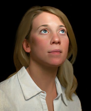
New Portrait Painting


Here is a new portrait painting. I thought I'd put a few progress shots with it. Originally I wanted to put the entire drawing process up with this but after reviewing the pictures I decided otherwise--they were a bit blown out and skewed. I will be better next time and take scans of the drawings. So this begins after the transfer, tone and reinforced lines (with raw umber paint). The painting is "14 x 11"
Douglas Flynt's New Blog
I wanted to make sure everyone was aware of Doug Flynt's new blog. His most recent post, "The Anatomy of Light on Form" is an excellent presentation of the many ideas that have shaped my approach to interpreting and painting form. Check it out: http://douglasflynt.blogspot.com/
Saturday, April 10, 2010
Interpreting Form: Diffuse Transmission


In this blog I will occasionally talk about some of the conceptual models I find useful when trying to understand the form I am painting. This week I thought I'd address a common phenomenon in translucent forms known as diffuse transmission. In diffuse transmission, light enters into an inhomogeneous surface, breaks down by continually loosing parts of the spectrum to increasing odds of absorption and exits with what visually appears as higher chroma and a shifted hue*, yet darker values than the reflected side of the object**. This can be contrasted with specular transmission where the visible spectrum does not suffer absorption in any measure and exits intact though possibly refracted.
*Let's say that a light emits photons with probability waves of Red, Orange, Green and Blue towards a surface. The surface is composed of atoms with 60% of the electrons having a frequency matching Green, 30% matching Blue, 10% matching Orange and none matching Red. At the surface a bunch of Red and Orange photons would diffusely reflect causing what would appear as an Orange-Red local. The saturation of this local would be neutralized slightly by the smaller percentage of Green and Blue photons who, despite having higher odds for absorption, still diffusely reflect at a smaller percentage across the surface. Light that enters the surface can scatter under the surface (a topic better left for another post) or transmit through. The odds of Green making it far into the surface without finding an absorption match is incredibly small, Blue may make it a little farther with Orange coming in second place to Red which transmits through with greater purity. This would leave us with a slight hue shift from Orange-Red on the diffusely reflected surface to something closer to Red on the Diffusely Transmitted side. Since there are fewer photons transmitting than reflecting, the value remains darker on the shadow side. (Keep in mind, the parts of the spectrum I'm using to describe this are just variables to illustrate the logic of this phenomenon and aren't specifically related to their various wavelengths and how they travel through different densities and distances--more topics for later posts)
**It should be noted that the values on the shadow side would be lighter when transmission is taking place than when it is not. This would be a logical conclusion (more photons=lighter value) in addition to being visually obvious. Above, I wanted to point out that with transmission the value gets darker with the chroma going up to contrast it with the chroma model I use on the diffusely reflected side where value and chroma go up proportionally as the form rolls towards the light (essentially seeing more of the object and therefore more of its local).
Two last things I'd like to point out: The computer generated diagram was made by me in Photoshop. It is a little unsteady and isn't the most solid demonstration of this activity. Maybe one day I will get 3D software and be able to build more consistent depictions of this stuff. Lastly, I'd like to add that I'm obviously not a physicist and other than actively reading about this stuff and discussing it with friends I'm unqualified to make absolute statements about what is happening on an atomic level. These models are the most consistent predictors for what I see daily as I paint and so far offer the most thorough explanation for Hue, Value Chroma shifts in form. I always want to get better and am always open to evolving and improving them. If by chance a physicist or anyone that finds fault in my thinking reads this, please leave a comment and publicly admonish me.
Tuesday, April 6, 2010
Additional Drawing Study for Painting

Just thought I'd add this to the drawings from this week's post. Because my figure drawings aren't very large I sometimes like to do a separate study of the portrait. This one goes to the figure posted below. I should point out as well that these aren't necessarily finished drawings...they are done to the point I need for beginning a painting. I hope to post short block-in demo videos in the near future that show how I develop these.
Saturday, April 3, 2010
You know you're in trouble when...


...your town is mentioned on the national news: record breaking rain and flooding, including my studio. Fortunately I was able to frantically ferry out all of my paintings and most valuables. It could have been a lot worse so despite losing a week of work to cleaning up I'm grateful for not losing more. It's a shame that I wasn't currently working on one of my whaling paintings or I could have passed the whole thing off as an elaborate setup.
Mild disaster aside, here are a couple drawings that were done for some of the paintings currently rotating on my easel.
Subscribe to:
Posts (Atom)